We appreciate everyone’s patience and feedback during the MobileXPRT 3 development process. We’re in the process of wrapping up some final testing and expect to release the Community Preview (CP) within the next week.
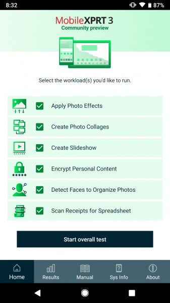
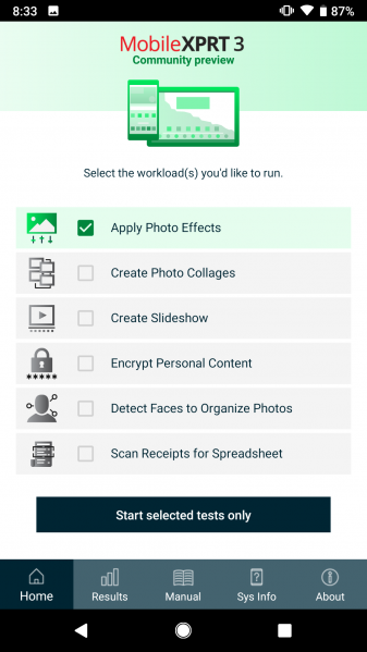
The first thing testers will notice about the CP is a new UI/UX experience. The aesthetic is completely different than MobileXPRT 2015. We’ve made it easy to select and deselect individual workloads by tapping the workload name, and we’ve consolidated common menu items into an Android-style task bar at the bottom of the screen to improve navigation.
Fundamentally, we rebuilt MobileXPRT with Android Studio SDK 27 to bring it up to date with contemporary Android development standards. While we kept the five workloads from MobileXPRT 2015, we gave one a major overhaul, updated the test content in the remaining four, and added a sixth workload: Optical Character Recognition. You can find more details about these changes in our earlier discussion about MobileXPRT 3 development in the blog.
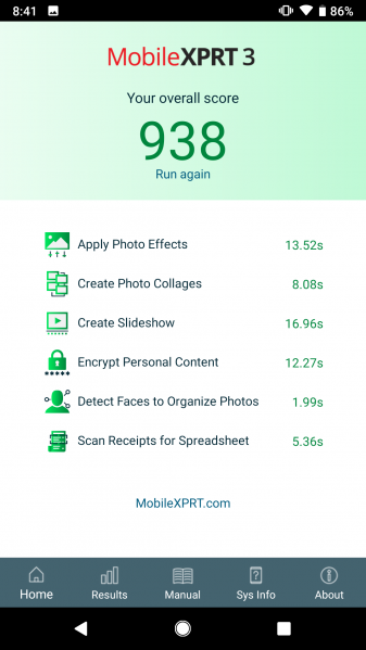
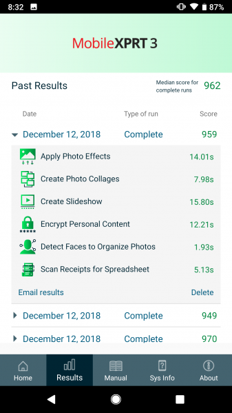
The screenshots below show the MobileXPRT 3 main screen, how the screen looks when users customize the combination of workloads, the end-of-test results screen, and the archived results page with one test result view expanded. Note that the archived results page also displays the median of all overall test scores completed to date.
We’ll announce the CP in a community message and here on the blog when it goes live. As with all community previews, the MobileXPRT 3 CP will be available only to BenchmarkXPRT Development Community members. If you have any questions about MobileXPRT 3 or joining the community, please let us know. Happy testing!
Justin


