I spent the last four days living with the Microsoft Band, and I’ve come away convinced it is the best smartwatch that I’ve used and a reasonable exercise device. I also think most of the issues I have encountered are ones that can be fixed as the software matures.
My reviews of a new product are usually based on weeks of use. This is not that. Instead, it is a set of initial reactions based on a few days of use. I concede that there may be some things that I have not have figured out yet.
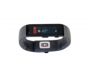
Like most folks, I was surprised when a friend emailed me that the Microsoft watch was set to debut the next day. Because I’m crazier than most folks, I went to the nearest Microsoft store the next morning and got one. As best I can tell, getting mine at 11:00am Eastern Time on Thursday makes me one of the first folks to own one.
Microsoft jammed into the relatively small device a lot of features, including a heart rate monitor, GPS, color touch screen, ultraviolet sensor, accelerometers, microphone, haptic feedback (vibration), and a Bluetooth connection with support for IOS, Android, and Microsoft phones. Indeed, there is little it is missing that other smartwatch and health monitors have, though it is not waterproof.
Getting all that functionality into a watch form factor is quite a feat. Microsoft accomplished it by housing much of the hardware in the watchband. The area under the clip contains the heart rate monitor, the back of the face holds the connector for a magnetic charger cable, and the sides hold a combination of logic and batteries.
For the heart rate monitor to work properly, you need to wear the Band tight on your wrist. This is not uncomfortable for me, but some folks may find it takes a bit of time to get used to. To ensure a snug fit, Microsoft sells it in three different sizes, but the only color is black. I think the Band looks good, though it is not meant to be a fashion accessory. I also found out that it is too bulky to fit under the buttoned sleeve of my dress shirts.
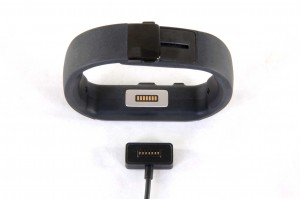
You can wear the Band either on the inside of your wrist or, more traditionally, on the top of the wrist. The heart rate monitor works fine either way. You can also orient the two buttons up your arm or toward your wrist, which also means it is fine on either wrist. I found that wearing it on top of my left wrist with the buttons facing up my arm worked best.
By default, the display is off unless you press the power button. I instead chose watch mode, which keeps the time constantly visible and only in black and white. That costs some battery life, but makes the device more useful. I wish you could easily toggle watch mode, maybe by hitting the action button, or have the display activate by shaking your wrist like it does on other smartwatches.
The vivid color touch screen provides a good user interface that feels very responsive. I found it very intuitive to use. You can customize some things, like which icons to include on the screen and their order. The Band does not support custom applications, but the built-in set, with things like weather, appointments, messages, and exercise, covers the information I most want to have.
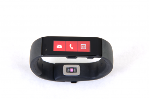
The Band does a good job of displaying incoming texts and calls, appointments, and emails. It stores enough of each that you can go backwards and see earlier messages or look forward at upcoming appointments. This is a nice improvement over the more limited capabilities of the Pebble smartwatch.
Generally, the software on the Band and its app look solid. While there are improvements I would like to see, it feels more like a version 1.0 product than something not ready for prime time. Most of the issues I have with the product are ones that I think can be addressed with software updates, which is good.
Like many fitness and activity trackers, the Band counts your steps and monitors your sleep. I find the sleep monitoring, especially with the heart rate monitor, to be a potentially useful feature. (Probably because I don’t get enough sleep!) You activate sleep mode by touching the moon icon and then pushing the action button.
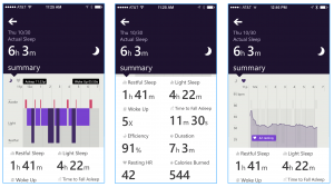
The screen shots from my iPhone show the wealth of data and highlight a couple issues. On the iPhone, not all of the data is immediately visible, and you can’t zoom or turn the display landscape. Further, there currently is no way to view the data on a Web site for analysis. That would be useful for looking at sleep and comparing multiple days of sleep. This deficiency is even more pronounced with exercise. Microsoft touts that data is stored in the Microsoft Health cloud. I could not find a way to access this data online, but they are certainly working on this functionality for the future.
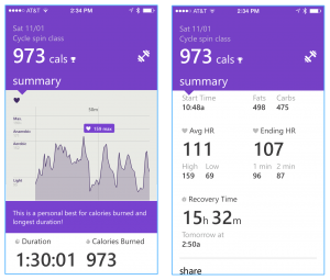
I used the Band’s general exercise function in a cycling spin class. I also wore a Garmin heart rate chest strap paired to the spin cycle using the wireless ANT+ protocol. I’ve used this combination many times and find it works very well. The Band was not always locked in on my heart rate, which caused it to slowly drift incorrectly, but that was not a big annoyance. You can see a bigger issue on the graph from my iPhone at about 40 minutes and again at 80 minutes. It shows that my heart rate dropped to 70s/80s. That did not happen, it was actually 30 to 40 beats per minute higher. Worth noting, the Band indicated the heart rate was locked in, so that does not seem to be the issue. (As an aside, I would like more details on the graph and maybe an X-axis with the time.) At the end of the workout, the Band showed my average heart rate as 111, not the 121 from my Garmin.
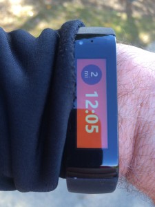
The Band fared much better when I used it on a 3-mile run. I wore it on one wrist and my Garmin Forerunner 220 on the other (with a chest strap to monitor my heart rate).
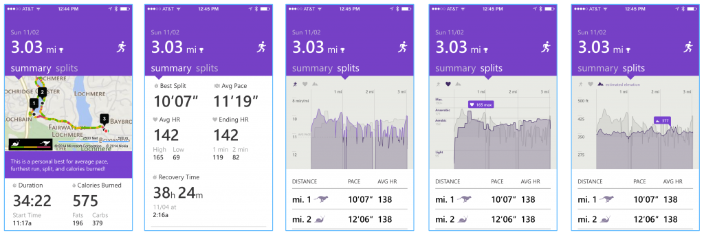
Generally, my heart rate on the Band lagged a bit behind what the Forerunner displayed, but they were similar. At the end of the run, the Band indicated an average heart rate of 142 and max heart rate of 165, which were very similar to the Forerunner’s 140 and 162. The two devices showed similar GPS distances as well.
I encountered two minor annoyances while running.
First, the Band’s screen is a bit hard to see through my sunglasses.
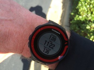
Second, the data the Band displays during the run: elapsed time, current heart rate, and total calories burned. The calorie count is good to know afterwards, but distance during the run would be much more useful. The Band vibrates at the end of each mile and shows the time for that mile. The data after the run is interesting, but does not compare to the depth available on something like Garmin Connect or Strava. In part, that is because you get only what shows up on the phone screen.
It is also annoying that you can monitor your heart rate data only during an activity such as sleep or running. I would like to have the ability to see what happens throughout the day.
The battery life is reasonable: it still had life left at the end of every day, which included such battery-draining activities as setting it to watch mode, tracking different types of exercise, and recording a night’s sleep. I’m not sure that it would make it through two whole days, but charging it every day is fine as long as it makes it through that day with battery to spare. That said, charging the Band takes too long. Getting a full charge took over two hours. I ended up settling for 80% or so, since that was plenty for a day’s activity. Ideally, the charging would take less than an hour, so it could happen while showering and getting ready for my day.
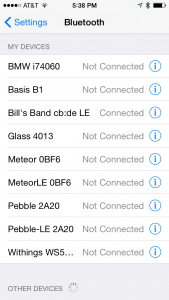
As with other smartwatches, I had a good dose of Bluetooth pairing issues. These seem subjectively fewer than I have with the Pebble, but I did have to re-pair every morning (I sleep more than 30 feet from my phone) and once or twice during every day. I admit up front that the problems I have may be related to the large number of devices I pair with my phone.
The Band was not compatible with my Android Asus MeMO 7 and Asus Nexus 7, so I did not get to test it on Android. My best guess is that this is because they are tablets and not phones. There is no iPad app either.
Despite the minor annoyances, the Microsoft Band is the best smartwatch currently available that works across a wide range of phones and is a solid, though somewhat limited, exercise device. I expect that software improvements will make it even better over the coming months. Sadly, this means that my venerable Pebble goes on the shelf. I plan to wear the Band until the Apple Watch debuts–unless the Basis later this month impresses me more… I’m starting to think that I need more wrists!


